The art of color in interior design (Part 2)
How to build a harmonious color palette
1) Start with something fixed
This could be:
- Flooring
- A large rug
- Stone countertops
- A favorite artwork
- Upholstery you’re keeping
Pull undertones from that element.
2) Identify the undertone
Is it warm (yellow/red based)? Or cool (blue/gray based)?
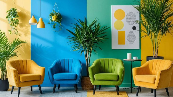
As you see in the examples below, mixing warm and cool isn’t wrong — but it must be intentional and balanced.
.png)
3) Use the 60–30–10 rule
- 60% dominant color (walls or large furnishings)
- 30% secondary color (upholstery, curtains)
- 10% accent (pillows, art, decor)
.png)
4) Layer in texture
Sometimes a space doesn’t need more color — it needs more texture.
Think:
- Linen
- Wood tones
- Woven materials
- Matte vs. gloss finishes
Texture creates visual interest without adding visual noise.
Color strategies for different rooms
Living Room
Aim for cohesion and warmth. Open-plan homes especially benefit from a restrained base palette with subtle shifts in tone.

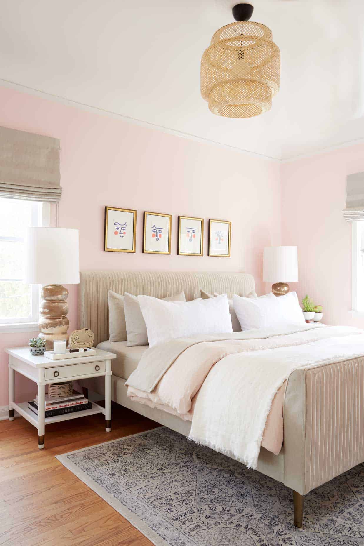
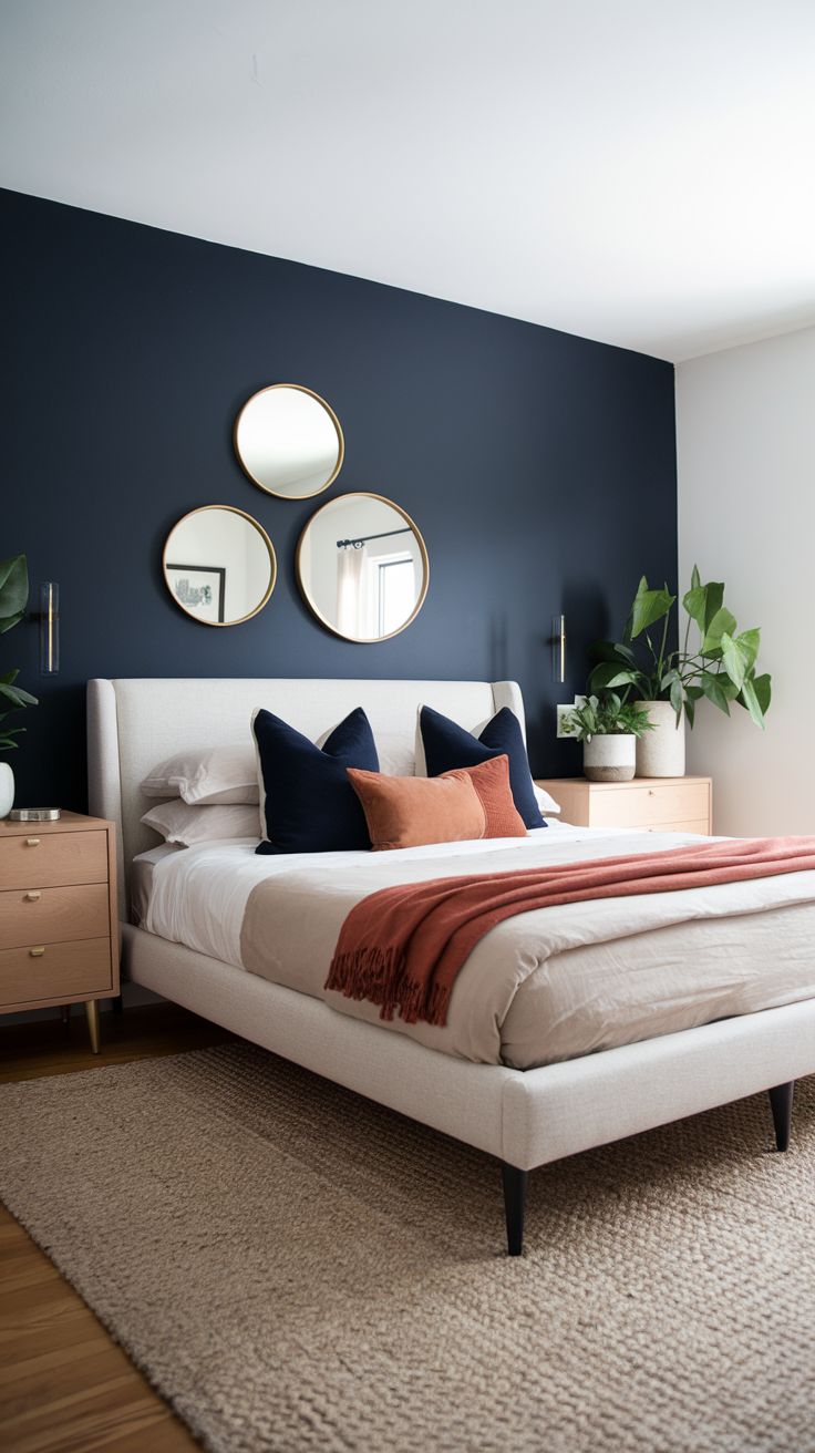
Bedroom
Lower contrast, softer transitions. Muted palettes promote rest.
Kitchen
Cabinet color can be a commitment. Neutrals age well, but an island is a great place to introduce some fun! Playing around with pendant lights or hardware is another way to bring in your unique style.
.png)
Kids’ Rooms
Instead of bright primary overload, try a muted base with playful accents that can evolve over time.
.png)
Common mistakes to avoid
- Choosing paint before fabrics
- Ignoring undertones
- Using too many bold colors at equal intensity
- Forgetting how lighting shifts color throughout the day
- Testing paint only on a tiny swatch
Paint adivce - always test large samples. Watch them in morning and evening light to make sure you love it!
A final thought on color
Color isn’t about trends — it’s about how you want your home to feel.
When chosen intentionally it creates rhythm, movement, and emotion within a space. It guides the eye. It softens architecture and creates a story. The most beautiful interiors aren’t the ones with the boldest palettes but ones where every hue feels considered.
When in doubt, start with a neutral foundation and build slowly. Layer by layer.
.png)
.png)