Presentation tips for designers

After 8 years of slaving nights before presentations both as a student and then as a design professional I’ve realized the following: No matter how awesome your idea is, if your presentation isn’t clear and concise, you’re in for a confused audience with plenty of critical feedback – be it your clients or professor.
Although I’m still learning the art of communicating my ideas well verbally, I do have some tried and tested tips to offer for the visual aspect:
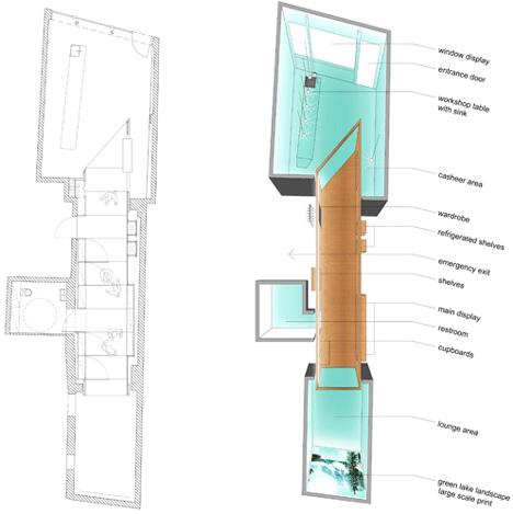
1) Less is definitely more
Only add images and words which are absolutely essential to conveying your message. Leave out anything you’re unsure about. Something like this:

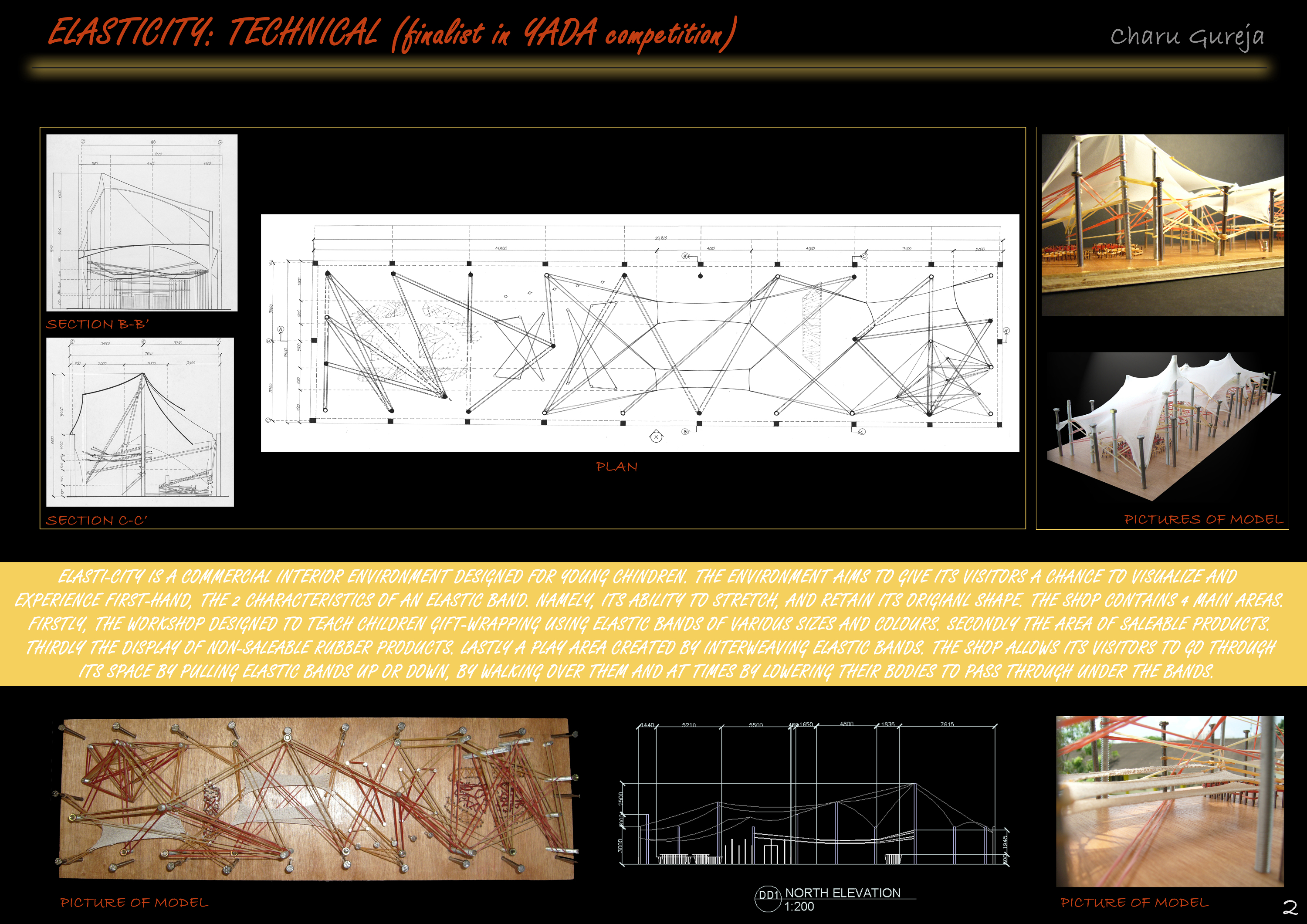
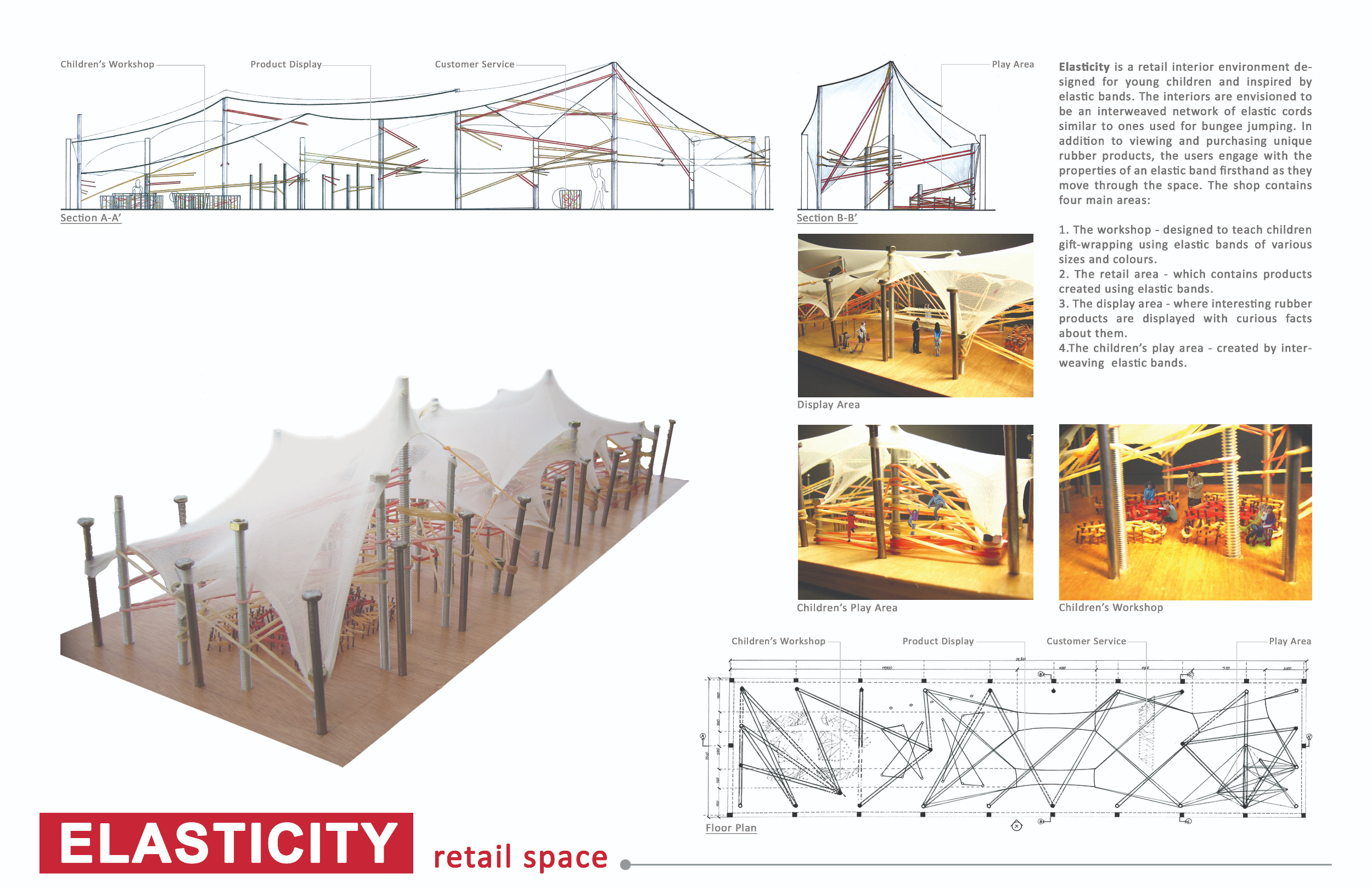
2) White is your best friend
After years of using black as my background color for everything, I’ve finally discovered the color white and it’s magical property of making everything appear clean, readable and professional. Don’t believe me? Here’s an example from my own portfolio. The first one was done when I had just graduated and the second shows the most recent version of the same project…what a difference!


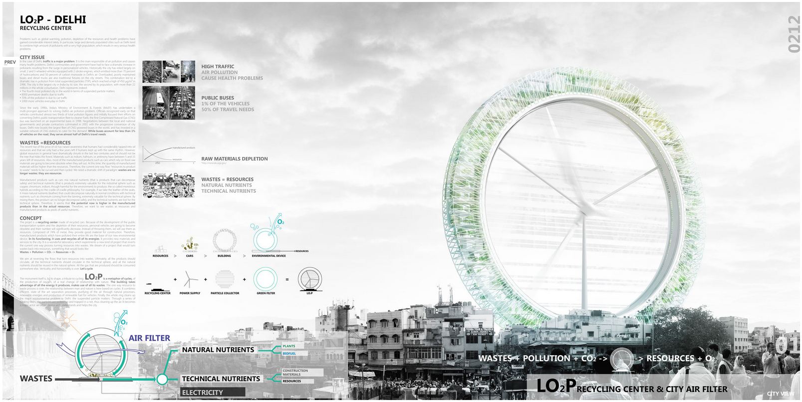
3) Keep your images crisp and font simple
Nothing turns your audience off more than blurry images and unreadable fonts. Make that extra effort to source or generate the clearest possible images. As for fonts, I’m pretty conservative and stick to the basics- Arial, Calibri and at times Function. In this example of a presentation board from Evolo, the clarity of the images and font helps convey the message despite the large amount of information.

4) It’s a balancing act
Whether it’s text or images,don’t overcrowd them in one spot, spread them out so the final product looks balanced. Here’s an example of this from Azure. Generally, I feel magazines display too many attention grabbing elements on the same page but Azure does a good job of keeping it balanced both in their online and print version:

5) Does this have a purpose?
This is somewhat reiterating the first point. Go through all the information you’ve added to your presentation slide/board and ask yourself if each image and sentence has a purpose. This helps filter out some information you thought would be helpful when you started but isn’t quite as essential now that you’re looking at the whole picture.
6) What if you didn’t get a chance to speak?
Lastly, ask a colleague or friend to look at your presentation material and check if it’s conveying the story you’re trying to tell without your verbal explanation. Do they understand it if you don’t say anything? The idea is to minimize any unpleasant surprises during your presentation as that can really throw you off.
Hope these tips and examples are helpful as you prepare for your next presentation :-). Feel free to add to this list and share your experiences as a presenter in the comments below!

.png)
.png)